One of the most important things to know as a scientist is when you’re stepping outside the limits of your expertise. Ideally, when speaking in the capacity of that role, we should confine ourselves to things we are certain we can communicate effectively, and defer to those with the nuance to articulate our hot takes better than we can outside of that. Therefore, not being a climate scientist myself, I’ve been hesitant to weigh in on any discussion of how that science is communicated, and what issues within this field are the most pressing in the fight to save our planet. But the situation really is becoming dire, and there also comes a point at which denying the amount of knowledge you have acquired stops being humble and starts being an impediment to serving your higher purpose. So with all that in mind, I am going to venture today to express one (1) single Hot Take.
Like most people around my age, I think the first time I really became aware of the global-scale catastrophes facing us due to our fossil-fuel-hungry industrialized society was when a middle school teacher wheeled in the old CRT TV to placate us for an afternoon in homeroom. Little did I know that the film we would be shown that day, Al Gore’s documentary-slash-world’s-most-expensive-powerpoint-presentation An Inconvenient Truth, would shake my naive childhood scientific optimism to its core, setting me on a path toward existential crisis that still haunts me to this day (more about that in a future post, maybe).
Perhaps the most shocking and significant figure presented in the entire film—and certainly the one that made the greatest impression on me as a young teen, just starting to discover the horrors of the real world that we were inheriting—is this one, showing a reconstruction of global temperatures and carbon dioxide concentrations over the past 650,000 years, along with projections of our emissions into the future:
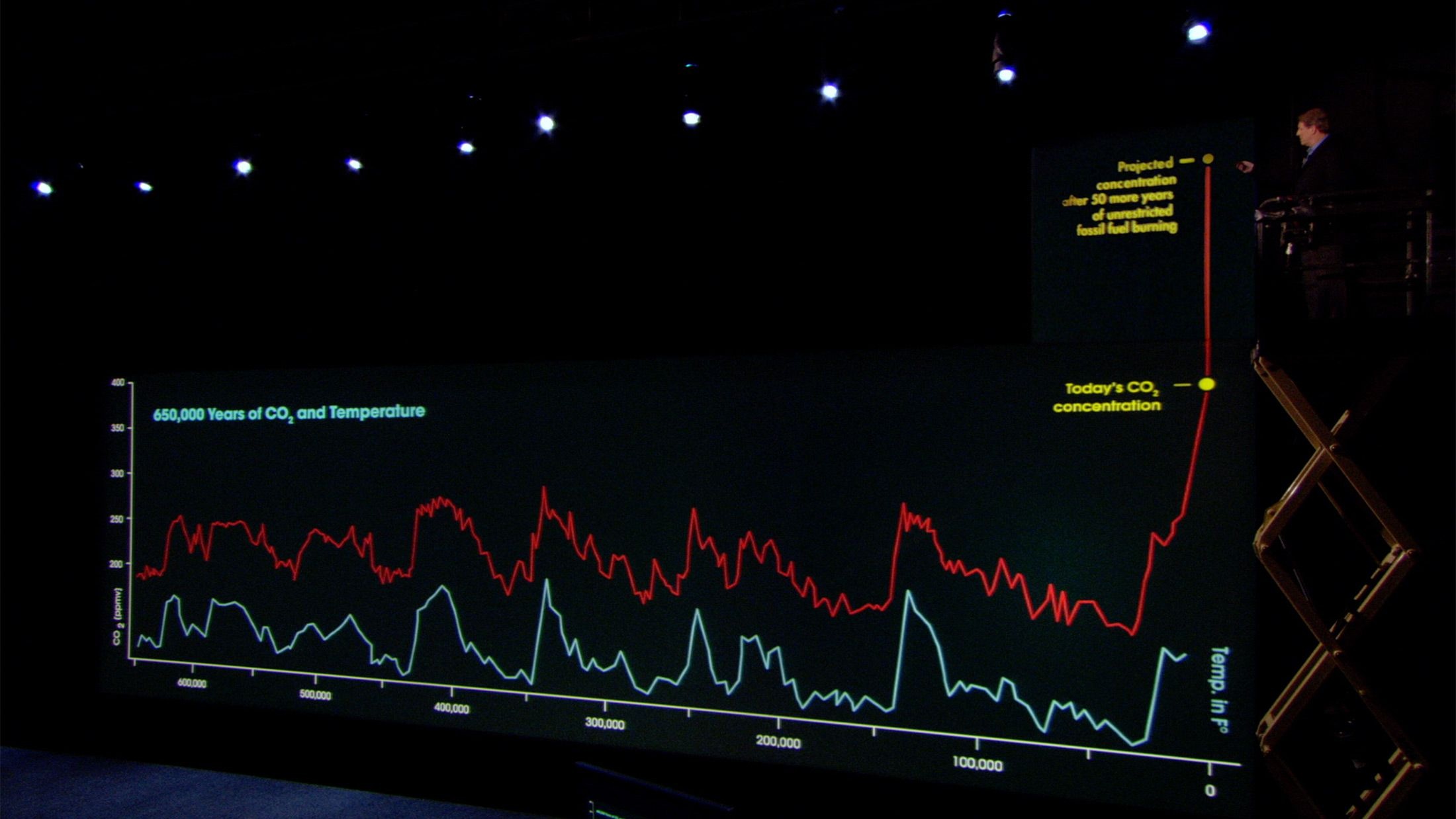
Looks pretty scary, right? “But hang on,” a casually skeptical mind might inquire, “why does the graph only go back that far? Is right now really the warmest the planet has ever been?” And if, like me, you have a background in Earth science, your immediate but slightly panicked response might be: “Well, um…”
An Inconvenient Chart
It’s because of questions like the ones above that I think the most important way of quantifying the immediacy and severity of anthropogenic climate change is being left out of the conversation, and it’s costing us innumerable battles in the long fight against denialism. Climate scientists often talk in terms of “temperature thresholds” and limiting the absolute change in global temperature by curtailing the emission of greenhouse gases, often with specific goals such as 1.5°C or 2°C above pre-industrial levels. But this metric of success unfortunately obscures the true reason we’re in such a dire planetary situation right now: the rate of change.
Ah yes, the good ol’ derivative. Though often ignored when laying out the facts of climate change in favour of easier-to-measure quantities, in reality it is this property of the current global temperature trend that is the entire reason for concern. As denialists will be quick to point out, it is true that we are still technically in an “ice age”,[1]Defined as “a long period of reduction in the temperature of Earth’s surface and atmosphere, resulting in the presence or expansion of continental and polar ice sheets and alpine glaciers”, according to Wikipedia with some of the coolest temperatures ever seen in our planet’s history. The absolute average temperature, or even the magnitude of temperature change, therefore, are not the most pertinent aspects when discussing the impacts of anthropogenic global warming (AGW for short). It is the rate at which we are causing this warming, and the lack of time for organisms—both human and non-human—to adapt to it that is the major looming threat in our immediate future.
Unfortunately, in my opinion, this factor is often communicated extremely poorly when otherwise well-informed people (including climate scientists themselves!) discuss the impacts of climate change. There are a number of ways this manifests, but let’s start out with the most obvious: the chart in An Inconvenient Truth.
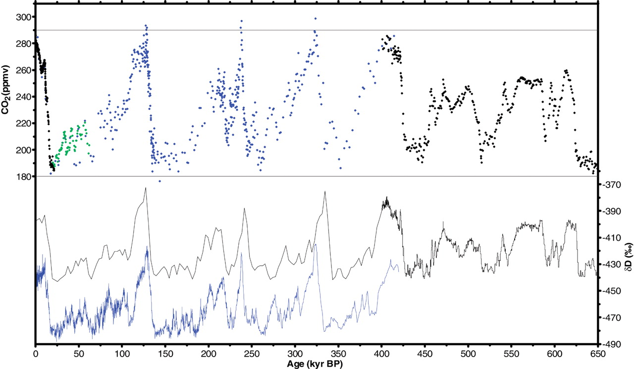
The data presented by Gore come from a 2005 paper by Siegenthaler and colleagues, who synthesize records of CO₂ concentrations and temperature over the past 650,000 years from several Antarctic ice cores. These data, as emphasized in the film, show a remarkable correlation over this time period, and it is true that the CO₂ levels seen today exceed any seen in over half a million years. However, there are two important points that AGW-denialists love to harp on in this data, so it’s best we get those out of the way before moving on to the broader issues at the heart of this post.
First, the temperature data are, obviously, not taken from thermometers carved out of rocks by stone-age cavemen or anything. There are, however, many physical, chemical, and biological processes on this planet that are strongly affected by the ambient temperature conditions in which they occur, and thus by studying how these processes vary in the modern era where we do have accurate temperature measurements, we can calibrate them and use them as “proxies” for atmospheric temperature in the past (more on this in a minute).
Second, there is an undeniable correlation between CO₂ and temperature, but the variations seen in this graph are actually not a great demonstration of the effects of adding excess CO₂ to the atmosphere by itself; on a more granular level, scientists find that CO₂ concentrations often lag the variations in temperature seen within these cores. This, however, is not the “EPIC Observation DESTROYS Soros-Funded Climate Hacks!1!!” that denialists would have you believe, and in fact is quite a well-understood phenomenon.
On the timescales seen in this chart, temperature fluctuations are largely controlled by Milankovitch cycles, variations in the Earth’s orbit that change its proximity and orientation to the Sun and thus the amount of energy received over various parts of the surface at different times of the year. These are the primary driving force behind the 10,000-100,000 year temperature spikes and dips seen in the ice core data. Carbon dioxide, meanwhile, while important in controlling global temperatures as a greenhouse gas, can also be affected by these temperatures as well, in what is known as a “feedback mechanism”.[2]There are a number of complicated reasons for this, but as an illustrative example, you can think about the amount of new, fertile land created when ice sheets form and sea levels fall, creating additional area for plants to grow and thus take up more CO₂. For a more thorough review of the Gore Graph and these feedback mechanisms, see this Carbon Brief article, which also covers how more recent studies actually show that the lag between CO₂ and temperature may be smaller than the one shown in An Inconvenient Truth, and in fact may even be nonexistent in some cases. Thus, as the temperature changes naturally over these very long timescales due to forcing from the Sun, the amount of carbon dioxide in the atmosphere can be forced to follow suit, itself in turn amplifying the effects of the initial temperature changes.
Another graph of average temperatures, this time over the Northern Hemisphere and limited to the past 1,000 years, was also featured in An Inconvenient Truth, and in the early 2000s it became one of the dominant tools used in communicating the rapidity and severity of anthropogenic global warming. This figure, originally created by Mann, Bradley, and Hughes in 1999,[3]And if you don’t have institutional access through that link, here’s another one that you should definitely not click if you don’t support the open spread of scientific knowledge around the globe is now infamously known as the “hockey stick graph”:


On the face of it, this is another exceptionally compelling and alarming figure. It shows that, over the past 1,000 years, global temperatures have been relatively stable until about the beginning of the 20th century, at which point they began to shoot up at a staggering rate that was only briefly interrupted in ~the 1940s-70s.[4]It turns out this was largely due to the increased emission of aerosols from dirty forms of combustion that proliferated after the second World War, which were eventually regulated due to their other harmful effects on the planet’s life (namely acid rain and lung-damaging air pollution). However, the controversy arises from the aforementioned use of proxy measurements to reconstruct temperatures before the advent of accurate thermometers in the 19th century.
As alluded to before, proxy measurements work by correlating observed changes in certain processes—tree ring growth, sediment accumulation, isotopic ratios of elements in ice, etc.—with observed temperatures, creating a relationship that can then be used to extrapolate temperatures into the past. Lurking under this conceptual simplicity are some significant scientific challenges, however, as there are many factors that can influence each proxy.[5]For example, age, precipitation, and long-term variations in available sunlight can affect tree ring growth just as much as temperature Proxy measurements are also, of course, generally limited to recording temperatures only near the part of the Earth where they are located, and so any one of them is not likely to capture a true global trend. But their strength lies in the large number of independent correlations between each proxy and the temperature record, and the fact that these can be statistically compared and synthesized across many regions of the planet over different time ranges. Although any one proxy is not likely to be representative, the Central Limit Theorem[6] comes to the rescue again, meaning that in aggregate they can give a fairly statistically robust picture of planetary climatic history. Science YouTuber and Oxford Mathematics Ph.D. Simon Clark breaks down both the controversy as well as the good, hard science of the hockey stick graph in this excellent video:
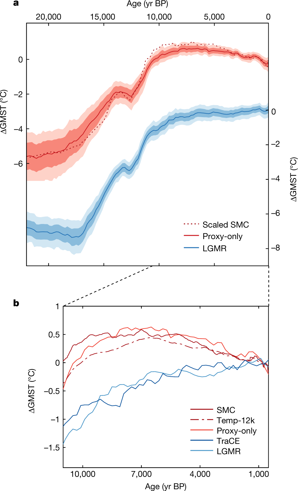
As Clark explains, a much more recent study aimed to update the graph by combining the best-calibrated proxy measurements[7]Specifically, geochemical proxies where the relationship between the isotopic species and temperature is well-quantified and easy to measure, as opposed to biological proxies that can have issues such as the presence of extinct species whose relationship to temperature variations is impossible to verify since they have no modern descendants with global circulation models to simulate temperatures across the planet from this sparse dataset, providing a robust treatment of the statistics of combining multiple proxies and a rigorous quantification of the uncertainties in their model. The study authors also validated their results against an independent dataset that was not used as part of their model input (the aforementioned ice core oxygen isotopes), which showed that this model was significantly better than any before at matching the patterns in the observed data. While the full technical details behind this work are somewhat difficult to appreciate at a layman’s[8]Read: my level, it’s undeniable that this is one of the most thoroughly-tested and validated temperature reconstructions ever produced.
And what did they find when they looked at temperatures since the last glacial maximum with this fresh lens? With the new model, the “bump” seen at the start of the hockey stick period actually disappears, meaning we can be confident that the temperatures we’re seeing now are truly unprecedented in all of human history:
Perhaps more importantly, they calculated the per-century rate of temperature change and compared this to that seen at the end of the last major glaciation. It’s known that several abrupt climatic episodes during this time interval were catastrophic events for our species and the planet as a whole,[9]With at least one of these events spawning its very own Ancient Aliens conspiracy theory in addition to the climate ones! so this would surely be a significant comparison if AGW-denialists are right and what we’re seeing now isn’t any worse than what we’ve been through in the past. Well, surprise, surprise: any time frame you choose to measure that 100-year span since 1850 shows rates at the very upper end of those seen during the deglaciation period, and as you shift that window towards the present the rates exceed essentially any seen in at least 24,000 years:
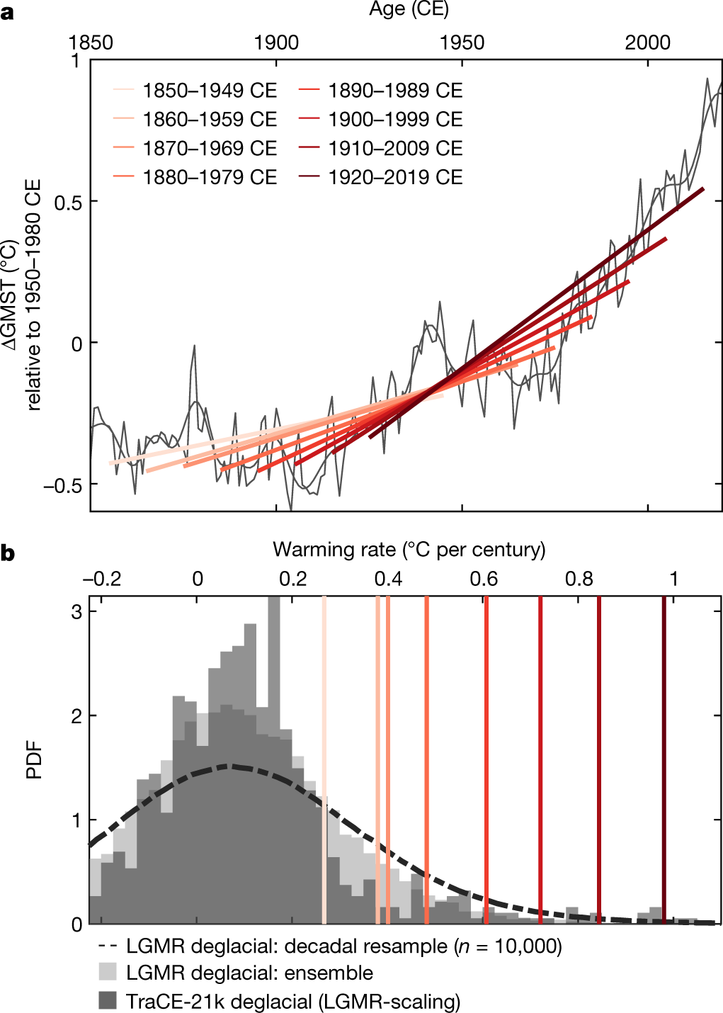
This kind of analysis is a rare turn towards embracing the critical metric of temperature change rates even within the scientific literature, so it was rather surprising that the figure above was not present anywhere in Simon Clark’s video discussing the paper. On the one hand, I kind of understand the hesitation to include it—what are all those different-coloured lines sloping at different angles? What do they mean? Humans, as a general rule, aren’t great at intuitively understanding rates of change the way we can raw magnitudes (see: every first-year calculus class ever). But de-emphasizing this aspect of our current warming unfortunately opens us up to all sorts of directions for attack, perhaps most infamously in the form of…
The Deceptiveness of “Deep Time”
In your travels through the murky, acrid backwaters of the climate “debate” internet you may have come across some comments such as these:


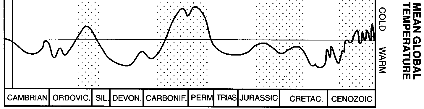
As you can see, AGW denialists love to whip out a version of a figure like this one, purporting to show global temperatures over the past 570 million years:

Take a look at the scale on the vertical axis, especially in comparison to the graphs for only the past 0.5 million years we saw above—what a range! Does this mean climate scientists are panicking over a present change in temperature that, on a geological scale, is like lighting a match in a walk-in freezer?
Well, not exactly, and this is where we return to our conceptual misunderstandings of rate and the difficulty comprehending the vastness of what geologists call “deep time”, the millions-to-billions of years that life has existed on Earth. The main issue is that, although the changes can appear dramatic in figures like these, the x-axis scale means the entire history of humanity wouldn’t span even a single pixel, and so the “rapid” jumps in temperature are actually stretched out over millions of years.
The other is a more subtle problem, which is the fact that figures such as these are not meant to be accurate representations of the continuous variation in temperature throughout the last 570 million years in the way the ice core measurements shown previously were. Instead, they are meant to schematically represent the transitions between “hothouse” and “icehouse” conditions. These are climatic states that the Earth has been hypothesized to flip between throughout its history: “hothouse” conditions were like those that prevailed during the time of the dinosaurs, when the poles were completely free of ice and tropical temperatures extended over much of the planet, while “icehouse” conditions include the one we are currently in, where ice covers at least one of the poles for at least part of the year, and temperatures can fluctuate more rapidly between frigid ice age and slightly warmer interglacial periods. Evidence for these two mostly-stable climatic states has been known since the 19th century based on geologic features indicative of approximate climatic conditions (glacial deposits, fossils of tropical reef-building organisms, coal layers, etc.), interrupted by what appeared to be relatively rapid transitions between them.
Now, after doing some sleuthing, it appears that the original source for the above figure is this paper by Christopher Scotese and colleagues in 1999. In that work, they attempt to understand the hothouse-icehouse transitions that the ancient southern supercontinent of Gondwana (modern day South America, Africa, Australia, India, and Antarctica) went through during the time that complex life has existed on Earth, that 570-million-year period we call the Phanerozoic. However, the caption for the figure in that paper states it is “modified from Frakes et al. (1992)”, which is a citation to a book published by University of Adelaide emeritus geology professor Lawrence Frakes and others in the early nineties, detailing their synthesis of the geologic and isotopic evidence for the hothouse-icehouse transitions. Their version of the figure, though, looks somewhat different than the “modified” version that made it into Scotese et al. (1999)…
Excerpt of the temperature portion of figure 11.1 in Frakes et al. (1992). Click here for the full figure, which also shows estimates of global sea level, volcanic activity, and atmospheric carbon dioxide (in the form of $$\delta^{13}\textrm{C}$$). Note also that the direction for warm vs. cool temperatures is flipped relative to the previous figure.
Although there are swings here, they are nowhere near as rapid and clearly-defined as in the Scotese et al. figure, which should be the first indication that it may not show what AGW-denialists think it does. You may also notice that the Frakes figure only shows “warm” and “cool” periods in a very broad sense, but does not actually give specific temperature values, while the Scotese figure does. So where did these temperatures come from?
As explained in an informal and accessible way by Chris Scotese himself in 2015 (warning: PDF link), the answer is basically a metric carbon-ton of simplification and extrapolation. Scotese et al. divided the present-day Earth up into various climate “zones” associated with particular biological or geological indicators, and used these to assign a classification for the “climate state” of the Earth as a whole, ranging from “Extreme Hothouse” to “Severe Icehouse”. They then examined the changes in the distribution of these climate zone indicators throughout geologic history, assigning different “climate states” to different time periods, mainly based on the types of indicators found near the poles:
Next, they calculated a “mean annual temperature” (MAT) based on the average pole-to-pole temperature gradient at present, and produced “representative” models of pole-to-pole temperature gradients for the other “climate states”, assigning each of them the MAT from that gradient. Finally, they used this correlation (plus a few other factors, e.g. the shifting fixed-point of the equatorial mean temperature) to derive a graph of equivalent MAT over time from the climate states inferred for each time period:
, Fig. 12")
, Fig. 8")
The result is an extremely coarse-resolution and rough guess at average global temperatures during these “hothouse” and “icehouse” states, and while this can be a useful tool to understand the broad-scale patterns of, for example, the major environmental factors driving evolution throughout the Phanerozoic, it is in no way similar to the kinds of quantitative isotopic measurements used to monitor more recent changes in global temperature.[10]A good resource I found that goes over many of these somewhat confusing and contradictory “deep time” climate graphs and tries to crowdsource better versions of them is this RealClimate post
This is one of the many tactics AGW deniers like to employ to muddy the waters of scientific discussion: they treat all graphs of past temperature, whether over hundreds of years or hundreds of millions of years, as essentially interchangeable (unless of course the figures don’t show what they want them to). Fundamentally, the major thing they ignore is that, as stated at the outset, it is not the absolute values of global temperature that matter to the delicate balance of life on our planet; it is transitions in these temperatures that are the major drivers of biodiversity change and collapse. However, and in my opinion much more damagingly, it often seems to be the case that even climate scientists themselves do not emphasize this distinction strongly enough. Which brings us to…
The Climate Communication Conundrum
Communicating climate science is hard, mainly because human brains are not wired to think on multi-decade timescales, let alone multi-century, -millennium, or -million-year orders of magnitude. And even with our supposed training to try to grasp these unfathomable time spans, I think there are some common pitfalls that scientists who aren’t used to the onslaught of misinformation in the climate “debate” still make, including how their well-intentioned presentations can be twisted into denialist ammunition. A great example that I recently stumbled upon was a figure shown in this Royal Institute talk by UK Met Office climate scientist Vicky Pope from 2021:
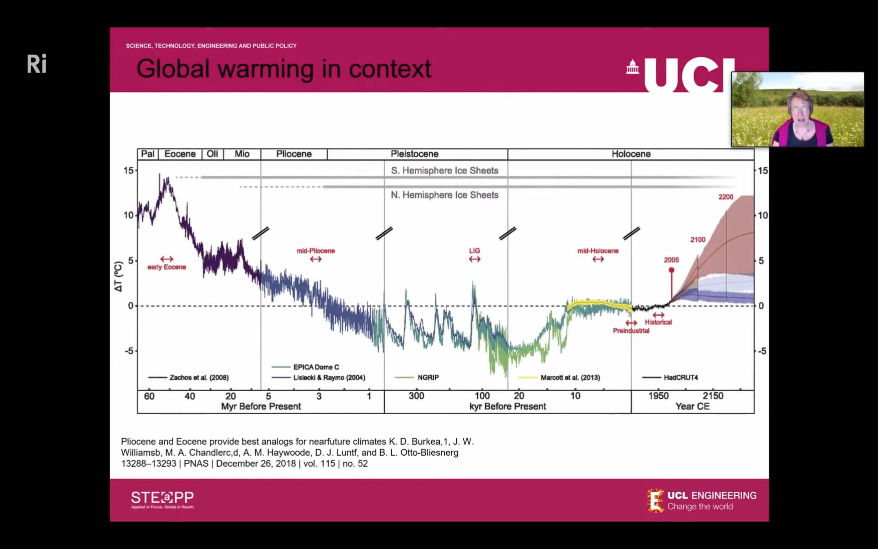
See the issue here? …How about now? Give you a hint: look in the 100-300 kyr B.P. section. “Wow, those spikes sure look pretty dramatic! And that decrease in temperature throughout the early Cenozoic looks about the same rate as the increase today! And the temperatures now are still way colder than they were then! What’s got all these scientists’ panties in a twist???”
…It’s the log scale. While this is totally a fine way to present this data in a scientific context, where the people using it are cognizant of the shift in time span represented by each of the graph’s sections, if a casual observer doesn’t notice this, it can seem like the rate of warming today (and of that projected into the future) isn’t really all that extreme. And as we’ve unfortunately, painfully learned throughout the COVID-19 pandemic, the general public do not understand log scales. Like, at all.
This is part of the problem with assuming a neutral and purely “rationalist” stance when presenting information on controversial topics to the public: bad actors will always seize on an opportunity to make your words look contradictory, confused, or flat-out wrong, no matter how plainly you state them. When we disregard the potential for our science to be interpreted in overly-simplified but persuasive ways, we often unknowingly hand rhetorical victory to purveyors of misinformation on a silver platter.
So what can be done to avoid this? I think, first and foremost, we need to be really clear about when we’re presenting actual data and when we’re making approximations. We need to state the limitations and uncertainties in that data, and do a better job of communicating how we’ve validated and calibrated it. And—my apologies if it’s getting repetitive at this point—we need to emphasize the importance of the unprecedented rates at which we’re changing the planet for the irreversible consequences hurtling our way.
No Such Thing As A Free Derivative
Of course, despite my objections and general grumpy attitude, I do understand why “just show the damn rate of change!!” hasn’t really taken off as a successful climate science communication strategy. For one thing, even obtaining estimates of these rates throughout geologic time that can be usefully compared to the present is rarely possible. The geologic record is notoriously fragmented, and as you travel deeper into the past you inevitably lose time resolution as rocks are metamorphosed or altered in ways that garble physical evidence. Additionally, as seen in figure 5 from the Osman et al. paper, the value you derive for any rate of change in a variable depends on the baseline used to measure it—you obviously can’t compare, for example, the average rate over a period of a million years to one extrapolated from the past century of measurements. And since we rarely have accurate and complete stratigraphic sequences at that level of detail from tens or hundreds of millions of years in the past, the challenge of how to compare these two vastly different spans of time is a daunting one.
Having said that, I was curious if anyone had actually tried to analyze temperature variation rates throughout geologic history like in the Osman et al. paper, giving some crucial context to how absolutely bonkers the current rate is in the history of our planet. And to my surprise, there are a few that have attempted this!
One study published in Nature in 2021 looked at this issue in the context of previous global mass extinctions, addressing the question of how the rate of global temperature change impacted the loss of biodiversity during these cataclysmic events. They used previously-acquired and normalized oxygen isotope, clumped isotope, and organic isotope paleotemperature proxy data collected from multiple regions around the world in order to examine average ocean temperature fluctuations over the span of the entire Phanerozoic. Of course, as mentioned, a complete record of changes over this time on the kind of human-scale fidelity we would like does not exist, so these authors catalogued rates of change on an approximately per-million-year basis; not ideal for comparisons to modern warming, but fine enough that the effects of the “Big Five” mass extinctions, which left paleontological imprints lasting at least millions of years, could be studied. Their results were intriguing:
, Fig. 1")
, Fig. 3")
As seen especially in Figure 3, the rate of change appears to be strongly correlated with loss in biodiversity, with all of the Big Five falling in the upper-right corner of the graph with \(\Delta T\) > 5.2°C, \(\Delta t\) < 0.4 Myr, and rate of change (\(R\)) > 10°C/Myr. These seem to define the “thresholds” described in the paper’s title for when mass extinction events occur. Unfortunately, because of the relatively long intervals used for \(\Delta t\), we cannot easily extrapolate this to the short baselines of our current warming trends. However, since we know the Big Five extinctions were quite abrupt and catastrophic events, it makes sense to examine them in more detail and compare the remarkable geologic evidence for their short-term changes to what we are beginning to see today.
The largest of these, the Permian-Triassic extinction,[11]Also more bluntly called the “The Great Dying”… yeah, it was bad has recently been discovered to be preserved in exquisite temporal detail at some locations on Earth, enabling scientists to very precisely study the timeline of its causes and effects. In the geologic blink of an eye 252 million years ago, 90% of all species on Earth went extinct, and unlike the more well-known dinosaur-killing end-Cretaceous extinction, this was likely due to massive and abrupt global warming that shares many parallels to what we are seeing today (rather than the global cooling and photosynthesis shutdown associated with an asteroid impact). A major study published in 2014 was able to constrain the timing of this event to 60\(\pm\)48 thousand years in duration, and a more recent study in 2019 shrunk this range even further, to 31\(\pm\)31 thousand years. Over this time interval, sea surface temperatures rose by 8-10°C, and ~36,000 gigatons of carbon were emitted into the atmosphere by massive volcanic eruptions. Despite these extraordinary absolute changes, the length of time over which they occurred means that this carbon must have entered the atmosphere at a rate of only about 5 Gt C/year. For reference, humanity exceeded that rate of emission in 1950, and today we emit over 11 Gt of carbon per year[12]Note that most quantifications of modern carbon emissions express these in gigatons of CO₂ per year, instead of only elemental C/year. The carbon atom in a CO₂ molecule makes up a little less than one third of its molecular mass—to convert between them, multiply Gt CO₂ by 0.273 to get Gt C, or conversely multiply Gt C by 3.67 to get Gt CO₂.
Another paper examines a more recent extreme excursion of global temperatures, the Paleocene-Eocene Thermal Maximum (PETM), where once again oxygen isotopic evidence indicates an impressive sea surface temperature rise of 5-8°C in a span of a few hundred thousand years. Interestingly, however, this rise was not accompanied by a significant extinction of non-marine life, a fact which has long puzzled paleontologists. The new study, published in Nature Geoscience in 2016, might hold the answer, and once again it’s all about rates: using some clever geochemical modelling techniques, the authors were able to more precisely constrain the interval over which the temperature rise occurred, and calculated a necessary emission rate of 1.1 Gt of carbon per year to achieve it—significantly lower than both our modern emission rate and even that of the end-Permian extinction. Thus, even with its geological limitations, carefully-examined evidence from the deep past shows us that the rates of change in both carbon and temperature we are seeing today are truly unprecedented in the history of complex life on this planet.
Talking (Endangered) Turkey
To bring this all home, I want to focus briefly on the positive changes I have seen recently in how climate scientists are thinking and talking about these problems, and how our now significant body of knowledge on the climate crisis is being communicated to policymakers and the general public. There was an excellent roundtable discussion at last year’s AGU Fall Meeting that addressed some of the issues with current suites of climate models and emissions scenarios used in compiling the predictions presented in high-level scientific documents like the IPCC reports:
It’s an hour-long discussion, so obviously I can’t address everything they talk about here, but to me the most striking and reassuring takeaway was the discussion of whether things like the “business as usual” scenarios were even relevant for this type of reporting anymore. While they were crucial in the early days of the IPCC when it was not at all clear governments would even pay attention, let alone take action, today they represent for the most part wildly unrealistic scenarios given the current progress across many of the highest historical emitters. Including these scenarios in future studies, then, may only serve to give ammunition to climate denial propagandists, by being able to cherry-pick these unlikely scenarios and go “See? See?? Their predictions were totally off, how can we trust them to get anything right!!” Things are likely to be bad enough as it is even in more “moderate” emissions scenarios, and we should be instead focusing on the fact that any scenario where we maintain net-positive carbon emissions is one where millions of people tragically and inevitably suffer.
Unfortunately, the reality is we now live in a world rife with misinformation and intentional bad-faith propagandists with a vested interest in maintaining the status quo, and thus need to be proactive about predicting and addressing the ways our data, models, figures, and even our words can be rhetorically wielded against us. I’m hopeful that we can have more of these conversations out in the open to show the honesty and self-correcting nature of the scientific process, both in how we conduct our research and, as demonstrated here, even what we research, ensuring we hew towards the most empowering and relevant information possible.
The story of how to study, understand, and communicate the threat of climate change is one that is by no means over, even though we’ve been sure about its causes and its likely eventual consequences for over half a century. Informational illiteracy, exacerbated by social media and its algorithmic newsfeeds, is not going away any time soon. It’s always darkest before the dawn, but I believe—perhaps with that still-naive pre-Inconvenient Truth part of my childhood heart—that the future before us is not a closed door. Every ton of carbon emissions, every degree celsius of warming avoided is a better world for future generations to inherit; no matter how bad things get, every incremental step we take now counts. And in the meantime, our best defence against those standing in our way might just be vigilance towards our own exploitable missteps.
…Okay, hot take over. To the climate scientists and science communicators, I welcome any skewering you think this deserves, and to everyone else, I’m curious whether you’ve seen these kinds of arguments and fallacies show up in your own lives, whether in IRL conversations or the great poisonous internet discussion soup. Hopefully we can all keep each other’s critical thinking skills sharpened, and with any luck start to shift the Overton window of this whole dishonest “debate” back to scientifically-grounded reality—at least in arenas where it actually matters.
Till next time,
-xoxo gossip grad ☾⋆⁺₊⋆